


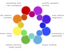
“LIGHT reveals the glories of the external world and yet is the most glorious of them all. It gives beauty, reveals beauty and is itself most beautiful. It is the analyzer, the truth-teller and the exposer of shams, for it shows things as they are.” Edwin D. Babbitt, Principles of Light and Color While interior design plans give plenty of attention to wall paint and floor colors, lighting plays a critical role that is too often overlooked. Color and lighting influence our psychological functioning and well-being on a day-to-day basis, and understanding these influences is important when creating “human-centric” spaces. Designers have been using advanced color knowledge in this way for years, and the customizability of LED lighting now allows them to do the same with light. Let’s take a closer look at LEDs and the psychology of light and color. Humanity’s fascination with color has been with us since the dawn of civilization, with different colors used to symbolize and express various moods in ancient artwork spanning from Greece to Tibet. Color theory can be somewhat subjective, as certain colors elicit varying reactions in individuals based on personal preference and cultural backgrounds. It’s a truly interesting scientific field, and a great deal of thought has gone into exploring the psychological effects of color. One way of comparing colors in the visible spectrum is to divide them into “warm” and “cool” categories. The warm colors include red, orange, and yellow—think of the sun setting on the beach, or maple leaves strewn across the yard in early fall. These colors generally convey passion, positive energy, enthusiasm and happiness. In contrast, the cool colors include green, blue and purple—think of a solitary walk on a full moon night, or the depth of the ocean sea beneath a sleeping fisherman’s boat. Those colors convey...
Why You Should Care About CRI...
posted by Flexfire LEDs
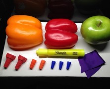
CRI, or Color Rendering Index, is the latest buzzword in consumer lighting circles. With the current phasing out of traditional incandescent bulbs, many consumers are scrambling to understand their remaining choices. Savvy lighting manufacturers understand this, and have invested a great deal in educating customers about things like color temperature, lumens, and now CRI. So how does CRI work? Basically, take a light bulb and shine it onto a few bright, colorful items. How natural do their colors look? Color Rendering Index is a mathematical measure of this, where a light source is tested and given a score from 0-100. Any light bulb, tube, or strip that measures greater than 90 is typically considered “High CRI”, and thus very effective at rendering natural-looking color at a given color temperature. As a point of reference, many of the fluorescent or other types of lighting that people consider “harsh” or “artificial” measure in the 50-70 CRI range. Take a look at the two photos above. In the first photo, under lights rated at CRI 57, the orange bell pepper has lost much of its natural color, appearing almost yellow. Similarly, the green apple, red bell pepper, and yellow marker appear dull and lifeless. In the second photo, under CRI 93 lighting, the colors are much more alive in comparison, down to the white board on which everything is placed. Testing for CRI requires special machinery designed specifically for this purpose. During this test, a lamp is shone onto eight different colors (or “R values”), termed R1 through R8. The lamp receives a score from 0-100 for each color, based on how natural the color is rendered in comparison with how the color looks under a “perfect” or “reference” light source at the same color temperature...